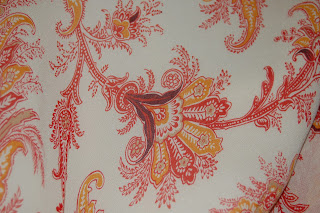
This is a napkin I took from a bridal shower, I have kept it forever, I loved the pattern, the photo does not due justice to the vibrancy of the colors, they are really bright, I wish I could find this print in fabric, I would love to use this for upholstery.
Saturday, October 30, 2010
My parents house is decorated in Early American style, that includes lots of wall paper, this is in there entry way, I used to hate it when I was a kid, now I kind of like it, its homey and comforting. It is apparently based on a genuine early American wall paper pattern in Boston, or so my mom told me. The same blues, rusts, and gold are repeated throughout the design I counted only 5 colors in the paper but the change in size of the color fields make it appear to be far more colorful than it is.
limtied color
Limited color in textiles is a natural for this post, I love printed textiles and designers who use prints, and one of my favorites is a British designer Zandra Rhodes. She began as an art student in the early 60’s and switched to textiles and latter became a designer. I love her work; her patterns are not only rich in color but also symbolism and context.
Thursday, October 14, 2010
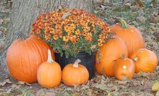
This picture was taken in overcast out-door lighting, the color relationship I noticed most strongly with my viewfinder did not show up in the photograph very well. The different colors of orange are self- explanatory, they ranged from medium tints to deep rusty browns. However the relationship that I found most interesting ( the one that is sadly lacking in the photo ) is a visual sensation that occurred around the small, pale orange pumpkins in the fore-ground. They are placed in front black flower pots, and in this position they seemed to have a pale blue ring surrounding them. I wish I could have captured this in the picture, however I doubt any camera could capture this optical phenomena.
This photo was taken in bright noon sunlight. It is a Dodge Viper, in candy-apple red, classic mid-life crisis transportation. The color is industrial paint derived; it split into two distinct colors under the direct sunlight. The first, is what I think is the show room red, bright, red blue, a classic primary. The other is a very pure magenta, it makes very distinct highlights on the red paint and I found it very beautiful. This
This image was taken in a relatively dark indoor space, I was working on the computer and I noticed the lights glowing under the paper I had just printed, the diffusion of the orange and green lights under the white paper was very beautiful so I grabbed my camera and took this picture. The white paper appeared a pale stone grey in the dim light. The single tone lights split into more subtle shades under the paper filter, the green made two prominent shades, one a pale yellow green the other slashes of a green screen with the addition of 2 or 3 parts tint. The orange light had a center of yellow orange spreading into medium orange and ending in tips of almost cadmium red.
Color relationships in the real world
This image was taken outdoors, in late afternoon sunlight; the Indian corn was in a shaded overhanging section of the roof. The colors range from, pale creamy yellow to deep almost metallic egg-plant brown; the kernels also display a range of medium browns and burnt sienna’s the kernels are self- contained neutrals that when placed next to one another make for an extremely colorful object.
Thursday, September 23, 2010
Am I a color hypocrite
Am I a color hypocrite?
In thinking about color in my life and world, I realized that I have a specific set of my own color rules that I began to notice. Firstly in my clothing, I don’t ware much color on my person, my wardrobe consists of mostly neutral tones, lots of black, navy, charcoal, brown and olive. Color in my clothing is never a random thing, never just thrown on or nonchalant. Combinations must be carefully considered, what colors will work well together? Do I mix neutrals with my color pieces? Even the color in my clothing tends to be somewhat muted, the hues tend to be rich rather than bright, with a few exceptions, wine, pine-green, cobalt and burnt orange. This color conservatism in my wardrobe is the polar opposite of the color found in my living space. Every room in my apartment is a different, generally very bright color, an eggplant living room, sunshine yellow kitchen with red dining table and electric green breakfront. Why is color such a good thing in my personal living space but not on my person?
Saturday, September 18, 2010
New Blog Post
Color in the world is generally quite random; we live among a chaos of haphazard colors, placed without relation to what surrounds them. Signs advertising products from fast food to movies blast us surround us, constantly bombarding us with their discordant hues. Golden arches peak above the horizon, next to brown and pink doughnut billboards. When I come across an instance of color organization it arrests my attention, no matter what the product, a systemic display of color will seize my attention. Some instances of this occurrence I noticed in thinking about this blog entry are. Yankee Candles, I bought the sent of the month, Autumn Leaves,
I immediately noticed the organized color arrangement of the candles, I am a sucker for this type of display
Friday, September 10, 2010
I hated the 64 pack kids in school, I was so jealous ! But I whined enough and eventually got a nice big box of my own!! It was color mastery at my finger-tips, I colored everything, even the wall-paper, it was not to my liking, a bit of trouble with the folks for that one, for some reason they did not appricate my red and purple butteflies just as the deal closed to sell the house we were living in, cretins.
Hi My name is Brooke and I am a color addict
Colorfulness, the description brings to mind instant associations. One can have a “colorful” personality or use “colorful” language. It denotes inhibition, exuberance a lack of super-ego, color is Id. Color is want, desire, instant reaction, the color of emotion, passion, joy is not black and white.
Friday, September 3, 2010
Saturday, August 28, 2010
#2 Color and Light
I have a Tiffany lamp, ok it’s not a “Tiffany” lamp, but one in the style ubiquitously associated with the company of breakfast at fame. Lamps generally have a primary role, to provide light, an article of utility. My lamp functions in another way as well, as a color object. In the daylight the lamp is a thing of pure color, the glass pieces as hard and impenetrable as jewels. Striations of opal visible among the peacock, leaf and azure chips, made bolder in shade by the licorice black bands that encase the tiles. At night color and light function together, there are two small, clear light bulbs that work separately from one another. You can light one or both bulbs, one pull causes the shade to glow softly, and the chips of glass seem almost amorphous, mobile, the once distinct panes blend into a solid mass, run through with strands of dark, pulsing, shadow.
Full power, the glass is no longer a physical object, but clean, colored, light. No subtleties to be found only jello segments, wet and glossy, pure, without nuance. Held confined in outer-space black iron cells. Somehow looking as if a cell wall were to be breached, the color would break free in an instant, a mushroom cloud, a title wave of leaf green or azure blue would spill out and cover everything in its syrupy glow, one color to rule them all!
However the magic lamp has one more trick aside from holding color fascism at bay or transforming into an object of soft, zen, contemplation. Looking up, the twining iron branches crossover the top of the shade, clear lamplight breaking through the openings; the light arranging itself into shapes, patterns, a language? I’m sure the contours have significance, I think if I stare long enough they might arrange themselves into meaning, if I’m patient enough, and willing to learn to see ,I will discover how to read them, watch this space, if it happens ,you will hear it here first!
Wednesday, August 25, 2010
Tuesday, August 24, 2010
Color Memory
At the age of 7 I asked for (and received) a subscription to Vogue magazine for my birthday. It was in it's pages I learnt the true name for ,what was at the time, my favorite color, hot pink. Hot pink was all I had ever known it to be called, when in thumbing through my issue of Vogue I came across some pictures of a wondrous lady. The writing accompanying the pictures was in the color I called hot pink. Not understanding many of the complex words in the article I rushed to have my mother read it to me. The ladies name was Elsa Schiaparelli, a fashion icon, rival to Chanel and the mother of the color shocking pink. I asked my mother if it was the same color as my favorite hot pink, she said it was but this name was older and probably unknown to most people. It was then I realized that I had a new favorite color Shocking Pink! It was the only way I wound refer to my “new” favorite. Jump to later in the same summer, the amusement park Great America, souvenir time, we three kids were allowed to choose one at the end of the day. Mine was a glamorous vinyl purse with tweety bird on the front. When the lady in the booth asked what I wanted I told her the shocking pink purse, she paused, and pointed at first to a pale pink bag, as I shook my head no she then came to my shocking pink purse. I never felt so glamorous, with my high fashion vocabulary and vinyl tweety purse swinging from my chubby, sun-burnt arm. I swaggered to the station wagon like I was walking a run-way, I felt I had lived up to my glamorous color that afternoon, shocking!
Monday, August 23, 2010
Subscribe to:
Posts (Atom)


