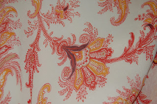
This is a napkin I took from a bridal shower, I have kept it forever, I loved the pattern, the photo does not due justice to the vibrancy of the colors, they are really bright, I wish I could find this print in fabric, I would love to use this for upholstery.
Hot Voodoo
Saturday, October 30, 2010
My parents house is decorated in Early American style, that includes lots of wall paper, this is in there entry way, I used to hate it when I was a kid, now I kind of like it, its homey and comforting. It is apparently based on a genuine early American wall paper pattern in Boston, or so my mom told me. The same blues, rusts, and gold are repeated throughout the design I counted only 5 colors in the paper but the change in size of the color fields make it appear to be far more colorful than it is.
limtied color
Limited color in textiles is a natural for this post, I love printed textiles and designers who use prints, and one of my favorites is a British designer Zandra Rhodes. She began as an art student in the early 60’s and switched to textiles and latter became a designer. I love her work; her patterns are not only rich in color but also symbolism and context.
Subscribe to:
Posts (Atom)


