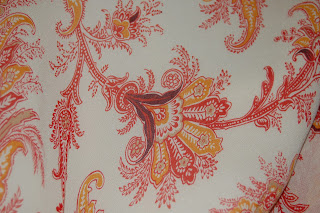
This is a napkin I took from a bridal shower, I have kept it forever, I loved the pattern, the photo does not due justice to the vibrancy of the colors, they are really bright, I wish I could find this print in fabric, I would love to use this for upholstery.
Saturday, October 30, 2010
My parents house is decorated in Early American style, that includes lots of wall paper, this is in there entry way, I used to hate it when I was a kid, now I kind of like it, its homey and comforting. It is apparently based on a genuine early American wall paper pattern in Boston, or so my mom told me. The same blues, rusts, and gold are repeated throughout the design I counted only 5 colors in the paper but the change in size of the color fields make it appear to be far more colorful than it is.
limtied color
Limited color in textiles is a natural for this post, I love printed textiles and designers who use prints, and one of my favorites is a British designer Zandra Rhodes. She began as an art student in the early 60’s and switched to textiles and latter became a designer. I love her work; her patterns are not only rich in color but also symbolism and context.
Thursday, October 14, 2010
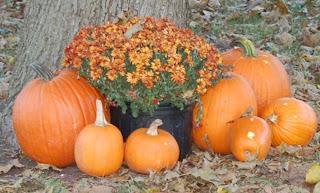
This picture was taken in overcast out-door lighting, the color relationship I noticed most strongly with my viewfinder did not show up in the photograph very well. The different colors of orange are self- explanatory, they ranged from medium tints to deep rusty browns. However the relationship that I found most interesting ( the one that is sadly lacking in the photo ) is a visual sensation that occurred around the small, pale orange pumpkins in the fore-ground. They are placed in front black flower pots, and in this position they seemed to have a pale blue ring surrounding them. I wish I could have captured this in the picture, however I doubt any camera could capture this optical phenomena.
This photo was taken in bright noon sunlight. It is a Dodge Viper, in candy-apple red, classic mid-life crisis transportation. The color is industrial paint derived; it split into two distinct colors under the direct sunlight. The first, is what I think is the show room red, bright, red blue, a classic primary. The other is a very pure magenta, it makes very distinct highlights on the red paint and I found it very beautiful. This
This image was taken in a relatively dark indoor space, I was working on the computer and I noticed the lights glowing under the paper I had just printed, the diffusion of the orange and green lights under the white paper was very beautiful so I grabbed my camera and took this picture. The white paper appeared a pale stone grey in the dim light. The single tone lights split into more subtle shades under the paper filter, the green made two prominent shades, one a pale yellow green the other slashes of a green screen with the addition of 2 or 3 parts tint. The orange light had a center of yellow orange spreading into medium orange and ending in tips of almost cadmium red.
Color relationships in the real world
This image was taken outdoors, in late afternoon sunlight; the Indian corn was in a shaded overhanging section of the roof. The colors range from, pale creamy yellow to deep almost metallic egg-plant brown; the kernels also display a range of medium browns and burnt sienna’s the kernels are self- contained neutrals that when placed next to one another make for an extremely colorful object.
Subscribe to:
Comments (Atom)


